Designing a responsive WordPress theme that looks great across all devices is crucial in today’s web design. One of the best ways to achieve this is by using a fluid grid system. A fluid grid allows your theme’s layout to adapt seamlessly to different screen sizes, ensuring that your content looks polished on desktops, tablets, and smartphones. In this guide, we’ll walk you through the process of creating a fluid grid system for your WordPress theme, covering the key concepts, benefits, and implementation steps.
What Is a Fluid Grid System?
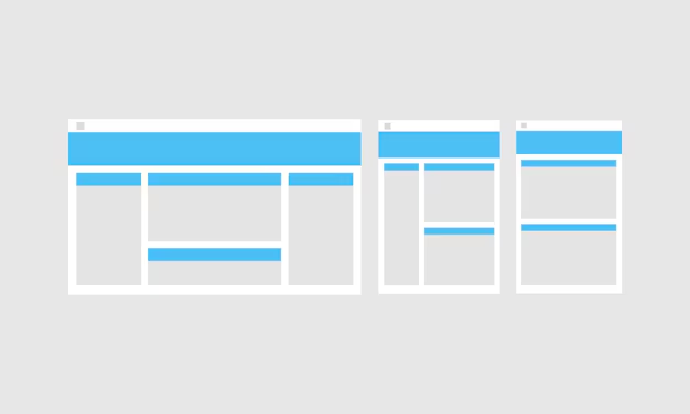
A fluid grid system is a layout structure that uses relative units, such as percentages, rather than fixed units like pixels, to define the size of elements. This makes the layout flexible and responsive, adjusting proportionally based on the screen size of the device. Unlike fixed grid systems, which may break on smaller screens, a fluid grid ensures that content flows naturally, providing a better user experience.
Why Use a Fluid Grid in Your WordPress Theme?
There are several reasons why implementing a fluid grid system in your WordPress theme can be beneficial:
- Enhanced Responsiveness: A fluid grid automatically adjusts to the screen size, ensuring your theme looks great on any device, from large monitors to mobile phones.
- Improved User Experience: With a fluid layout, users don’t have to scroll horizontally or zoom in and out to view content, resulting in a more user-friendly website.
- Better SEO: Google prioritizes mobile-friendly websites in search rankings, and a responsive design with a fluid grid can improve your website’s visibility on search engines.
- Consistency: A fluid grid ensures that the visual structure of your website remains consistent, regardless of the device being used to view it.
Building a Fluid Grid System for Your Theme
To create a fluid grid system for your WordPress theme, you need to follow a few basic steps. Let’s go through each step to understand how to implement a flexible and responsive grid structure:
Step 1: Define the Grid Container
The first step is to define a container that holds all your grid elements. The container should have a maximum width and use relative units like percentages to ensure that it scales smoothly:
.container { max-width: 1200px; margin: 0 auto; padding: 0 15px; } This code sets a maximum width for the container to 1200px, centers it horizontally, and adds padding on the sides for a better layout on smaller screens.
Step 2: Create the Fluid Grid Columns
Next, create columns inside your container using percentage-based widths. For example, if you want a three-column layout, you can define columns like this:
.row { display: flex; flex-wrap: wrap; } .col-1-3 { width: 33.33%; } .col-1-2 { width: 50%; } .col-1-4 { width: 25%; } In this example, the .row class uses Flexbox to align columns horizontally. The .col-1-3, .col-1-2, and .col-1-4 classes define columns that take up one-third, half, and one-quarter of the container, respectively.
Step 3: Add Media Queries for Breakpoints
To ensure that your grid system adapts to different screen sizes, use media queries to adjust the layout at specific breakpoints. For instance, you can change the column widths for smaller screens like this:
@media (max-width: 768px) { .col-1-3, .col-1-2, .col-1-4 { width: 100%; } } This media query sets the width of all columns to 100% when the screen width is 768px or less, stacking them vertically for a mobile-friendly layout.
Step 4: Integrate the Fluid Grid into Your WordPress Theme
Now that you have defined your grid system, integrate it into your WordPress theme by adding the CSS to your theme’s style.css file. You can then use the grid classes in your theme templates:
<div class="container"> <div class="row"> <div class="col-1-3"> <h2>Column 1</h2> <p>This is the first column.</p> </div> <div class="col-1-3"> <h2>Column 2</h2> <p>This is the second column.</p> </div> <div class="col-1-3"> <h2>Column 3</h2> <p>This is the third column.</p> </div> </div> </div> This code will create a three-column layout that adjusts automatically based on the screen size, thanks to the fluid grid system.
Tips for a Better Fluid Grid System
When implementing a fluid grid system in your WordPress theme, keep the following tips in mind:
- Use Relative Units: Avoid using fixed units like pixels for widths and margins. Instead, use percentages or
emunits for better scalability. - Test on Different Devices: Make sure to test your theme on various screen sizes and devices to ensure that it adapts properly.
- Optimize for Performance: Minimize your CSS file size and use media queries efficiently to reduce page load times.
- Leverage Flexbox or CSS Grid: Modern CSS layout systems like Flexbox and CSS Grid make it easier to create fluid layouts. Consider using them for better flexibility.
Conclusion
Creating a fluid grid system is an essential skill for WordPress theme developers who want to ensure their themes are fully responsive and user-friendly. By following the steps outlined above, you can build a flexible grid that adapts to any screen size, providing a consistent user experience across all devices. Whether you’re creating a theme for a blog, portfolio, or eCommerce site, implementing a fluid grid system will help you deliver a modern and engaging website that your users will love.
Start experimenting with your fluid grid system today and see how it can elevate the design and usability of your WordPress theme!

