In today’s mobile-first world, optimizing your WordPress theme for tablets and smartphones is crucial. With a large percentage of users accessing websites through mobile devices, ensuring that your theme looks great and functions smoothly on these smaller screens can significantly improve user experience and SEO rankings. This guide covers the essential steps to make your theme responsive and mobile-friendly, making it ideal for users who browse on tablets and smartphones.
1. Use Responsive Design
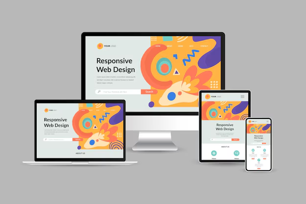
Responsive design is the backbone of mobile-friendly themes. A responsive theme automatically adjusts its layout based on the user’s screen size, providing a seamless experience on desktops, tablets, and smartphones. To ensure your theme is responsive:
- Fluid Grids: Use a flexible grid system where elements are defined in percentages rather than fixed pixel widths. This allows the content to scale up or down based on the screen size.
- Media Queries: Use CSS media queries to apply different styles based on screen width, height, and orientation. For example:
This code will adjust the padding for devices with a screen width of 768px or less, which is common for tablets.@media (max-width: 768px) { .content { padding: 10px; } }
2. Optimize Images for Mobile Devices
High-resolution images can slow down loading times on mobile devices, leading to a poor user experience. Optimizing images is key to ensuring fast loading times. Here’s how you can do it:
- Use Responsive Images: Use the
<picture>element or thesrcsetattribute to serve different image sizes for different screen resolutions. This way, smaller images load on mobile devices, saving bandwidth.<img srcset="image-small.jpg 480w, image-medium.jpg 768w, image-large.jpg 1200w" sizes="(max-width: 768px) 100vw, 50vw" alt="Responsive Image"> - Image Compression: Use plugins like Smush or EWWW Image Optimizer to compress images without losing quality, reducing load times for mobile users.
3. Simplify Navigation for Touch Screens
Navigation is different on touch screens compared to desktop devices. Menus should be easy to access and navigate with fingers rather than a mouse. Here are some tips:
- Mobile-Friendly Menus: Use dropdown or slide-in menus that are optimized for touch screens. Consider using a “hamburger” icon that expands into a full menu when tapped.
- Large Tap Targets: Ensure that buttons, links, and menu items have enough space around them so users can easily tap them without accidentally clicking other elements.
- Avoid Hover Effects: Since hover effects are not functional on touch screens, avoid using them for navigation or make sure they have a fallback behavior for mobile users.
4. Optimize Fonts and Text for Readability
Text that is too small or cramped can be difficult to read on mobile devices. Adjust font sizes and line spacing to ensure your content is readable on all screen sizes:
- Responsive Typography: Use relative units like
emorreminstead of pixels for font sizes, so they scale appropriately on different screen sizes. - Adjustable Line Height: Ensure there is enough line height (space between lines) to make reading easier on smaller screens. A line height of 1.5 is generally considered optimal for body text.
- Viewport Meta Tag: Include the following meta tag in your theme’s header to ensure text is scaled correctly:
<meta name="viewport" content="width=device-width, initial-scale=1.0">
5. Test Your Theme on Multiple Devices
Testing is a critical step to ensure that your theme performs well across different devices. Here’s how you can effectively test your theme’s mobile compatibility:
- Use Browser Developer Tools: Most modern browsers have built-in developer tools that allow you to test your site’s responsiveness. For example, in Google Chrome, you can use the “Toggle Device Toolbar” feature to view your site on different screen sizes.
- Real Device Testing: While developer tools are useful, testing on real devices (like various smartphones and tablets) gives you a better idea of how your theme performs in real-world scenarios.
- Online Testing Tools: Use online tools like BrowserStack or Responsinator to see how your theme looks and behaves on different devices and operating systems.
6. Optimize Loading Speed with Caching and Minification
Mobile users expect fast-loading websites. Slow sites can lead to high bounce rates, which can negatively impact your search engine rankings. Speed up your theme with these techniques:
- Minify CSS, JavaScript, and HTML: Use plugins like WP-Optimize to minify your CSS, JavaScript, and HTML files, reducing file sizes and speeding up load times.
- Enable Browser Caching: Caching allows frequently accessed files to be stored locally on users’ devices, reducing the need for reloading them on each visit.
- Use a Content Delivery Network (CDN): CDNs like Cloudflare store copies of your site’s content on servers around the world, delivering it faster to users based on their geographic location.
7. Implement Lazy Loading for Images and Videos
Lazy loading is a technique where images and videos are loaded only when they come into the user’s viewport. This can drastically reduce initial load times, especially for mobile users:
- Use WordPress Plugins: Use plugins like a3 Lazy Load or Lazy Load for Videos to enable lazy loading on your WordPress site.
- Native Lazy Loading: WordPress now supports native lazy loading for images with the
loading="lazy"attribute, which you can add to your<img>tags:<img src="image.jpg" loading="lazy" alt="Lazy Loaded Image">
Conclusion: Build Mobile-First WordPress Themes for Success
Optimizing your WordPress theme for tablets and smartphones is no longer optional—it’s essential. By focusing on responsive design, simplifying navigation, optimizing images, and ensuring fast loading times, you can create a theme that provides a great user experience across all devices. This not only improves user satisfaction but also helps your theme stand out in search engine results, attracting more users and driving engagement.
As mobile traffic continues to grow, designing for tablets and smartphones can give you a competitive edge. Use the strategies outlined in this guide to make your WordPress theme mobile-friendly, and you’ll be well on your way to creating a successful, user-focused website.


