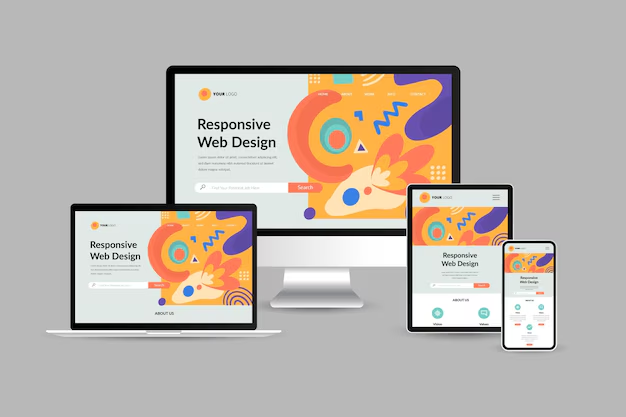
As more users access websites from a variety of devices, choosing the right design approach for your WordPress theme becomes crucial. Two of the most popular methods for creating mobile-friendly websites are responsive design and adaptive design. But which one is best for your theme? In this guide, we'll dive into the differences between responsive and adaptive design, explore their benefits and drawbacks, and help you determine which is best suited for your project.
What Is Responsive Design?
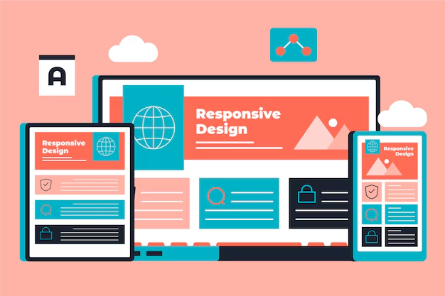
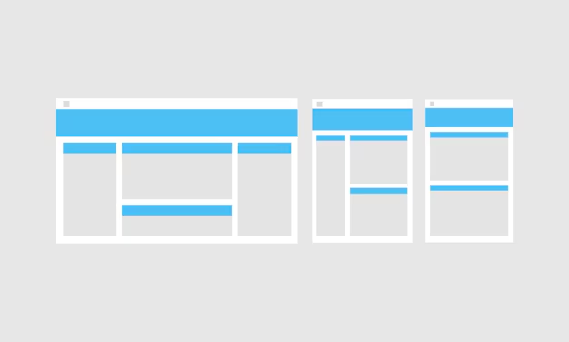
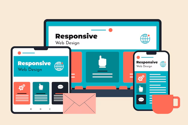
Responsive design is a design approach that aims to provide an optimal viewing experience across a wide range of devices. It uses fluid grids, flexible images, and CSS media queries to adjust the layout of a website dynamically based on the screen size and orientation of the device being used.
With responsive design, your theme’s layout adapts automatically to fit any screen size, from desktops and tablets to smartphones. The content resizes and repositions itself fluidly, ensuring a seamless user experience.
Key Features of Responsive Design
- Fluid Grids: Uses a grid system where elements are sized in relative units (like percentages) rather than fixed units (like pixels).
- Flexible Images: Images and media scale based on the screen size, ensuring they fit within their container.
- Media Queries: CSS media queries allow different styles to be applied at different screen sizes, making it easier to adjust the layout for various devices.
What Is Adaptive Design?
Adaptive design, on the other hand, focuses on creating multiple fixed layouts that are tailored to specific screen sizes. When a user accesses a website, the adaptive design detects the user’s screen size and serves the most appropriate layout for that device.
Adaptive design doesn’t fluidly adjust like responsive design; instead, it offers distinct layouts for different screen sizes. For example, there might be separate layouts for mobile phones, tablets, and desktops.
Key Features of Adaptive Design
- Multiple Fixed Layouts: Creates different layouts for various screen widths, like 320px, 768px, 1024px, etc.
- Device Detection: Uses JavaScript or server-side scripts to detect the user’s device and deliver the appropriate layout.
- Optimized User Experience: Each layout can be fine-tuned for specific devices, ensuring a tailored experience for each user.
Pros and Cons of Responsive Design
Pros
- Flexible and Fluid: Responsive design automatically adjusts to fit any screen size, providing a consistent user experience across all devices.
- Easier to Maintain: Since you only need to manage a single layout that adjusts for all screen sizes, updates and maintenance are more straightforward.
- SEO Benefits: Google recommends responsive design, and having a single URL for all devices improves SEO by reducing duplicate content issues.
Cons
- Potentially Slower Loading Times: Since all content is downloaded regardless of the user’s device, responsive design can sometimes result in slower loading times, especially for mobile users.
- More Complex CSS: Creating fluid layouts and ensuring consistent behavior across all screen sizes requires more complex CSS, which can be challenging for beginners.
Pros and Cons of Adaptive Design
Pros
- Faster Loading Times: Because the design serves only the necessary content for each device, adaptive design can result in faster load times, especially for mobile users.
- Tailored Experience: Allows for highly customized user experiences for each device type, providing better control over the appearance and behavior of the site on different screens.
- Optimized for Specific Devices: You can create layouts that take full advantage of the unique capabilities of each device, like mobile-specific features.
Cons
- More Complex to Develop: Building and maintaining multiple layouts can be time-consuming and requires more development resources.
- Higher Maintenance: Updating content or making design changes often requires modifying each layout, which can be tedious and increases the chances of inconsistencies.
- SEO Challenges: Managing multiple versions of the same content can create challenges with SEO, as search engines may view the different layouts as duplicate content.
Responsive Design vs Adaptive Design: Which Should You Choose?
The decision between responsive and adaptive design depends on your project’s needs, resources, and target audience. Here are some key considerations:
- Choose Responsive Design If:
- You want a single design that works across all devices without needing to create multiple layouts.
- Your website needs to be easily scalable to accommodate new devices as they come out.
- You are looking for a design approach that is easier to maintain and update over time.
- Choose Adaptive Design If:
- You want to create highly tailored user experiences for different devices.
- You have the resources to develop and maintain multiple layouts for different screen sizes.
- Your target audience primarily uses specific devices (e.g., mostly mobile or tablet users).
Conclusion: Finding the Right Approach for Your Theme
Both responsive and adaptive design have their advantages and drawbacks, and the best choice for your WordPress theme depends on your specific goals. Responsive design is more flexible and easier to manage, making it ideal for most websites that need to adapt to a variety of devices. Adaptive design, however, offers the advantage of customized experiences for different devices but requires more effort to develop and maintain.
If you are designing a theme that will be used by a wide audience with different devices, responsive design is likely the better choice. However, if you are building a website where user experience is critical and you have the resources to manage multiple layouts, adaptive design can be a great way to deliver a tailored experience. Ultimately, understanding your audience and their needs will guide you in making the best decision.

