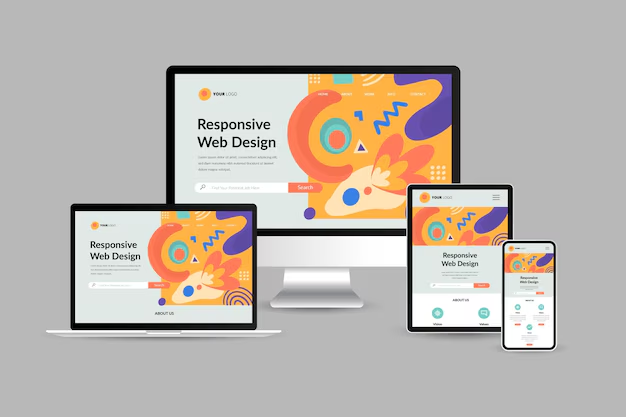
In today’s digital landscape, ensuring your WordPress theme is mobile-responsive is crucial. With an increasing number of users accessing websites through smartphones and tablets, your theme needs to deliver a seamless experience across all devices. A mobile-responsive theme automatically adjusts its layout, images, and content based on the screen size, providing optimal viewing and interaction. In this guide, we'll walk you through various methods to test your WordPress theme for mobile responsiveness and ensure a flawless user experience.
Why Is Mobile Responsiveness Important?
Mobile responsiveness is no longer optional—it’s a necessity for any website. Here’s why it matters:
- Improved User Experience: A responsive design ensures that users can easily navigate your website on any device, reducing bounce rates and encouraging engagement.
- Better SEO Performance: Google prioritizes mobile-friendly websites in search rankings, making responsiveness essential for better visibility and organic traffic.
- Wider Reach: A responsive website can reach users on smartphones, tablets, and other devices, expanding your potential audience.
Methods to Test Your Theme for Mobile Responsiveness
There are several ways to test your WordPress theme’s responsiveness. Here are the most effective methods:
1. Use Browser Developer Tools
Most modern browsers come with built-in developer tools that allow you to test how your website looks on different screen sizes:
- Google Chrome: Right-click on your website and select Inspect or press
Ctrl+Shift+I. Click on the Toggle Device Toolbar (icon resembling a smartphone and tablet) to view your website in various screen resolutions. - Mozilla Firefox: Right-click on your page and choose Inspect Element. Click on the device icon to test responsiveness.
- Microsoft Edge: Right-click and select Inspect, then use the Toggle Device Emulation feature.
This method allows you to view your site in different device resolutions, such as smartphones, tablets, and desktops. You can adjust the width and height to test various screen sizes.
2. Online Responsive Testing Tools
Several online tools provide a quick and easy way to test your theme’s responsiveness without needing a browser’s developer tools. Some popular options include:
- Responsinator: A user-friendly tool that displays how your site looks on multiple devices, including iPhones, Android devices, and tablets.
- BrowserStack: A premium tool offering real-device testing for various screen sizes and operating systems, ensuring your theme works perfectly on every device.
- Responsive Design Checker: Test your website’s responsiveness across different screen sizes and resolutions for free.
3. Test on Actual Devices
While online tools and browser emulators are helpful, testing your theme on real devices provides the most accurate results. If possible, test your website on a variety of physical devices, such as:
- Smartphones (iPhone, Android)
- Tablets (iPad, Samsung Galaxy Tab)
- Laptops and Desktops with varying screen sizes
Testing on real devices allows you to experience how your website performs, ensuring that all touch interactions, scrolling, and navigation work smoothly.
4. Use Google’s Mobile-Friendly Test
Google’s Mobile-Friendly Test tool is an excellent way to ensure your theme meets Google’s mobile compatibility standards. Simply enter your website’s URL, and Google will analyze your page to determine if it’s mobile-friendly. It will also highlight any issues that need to be addressed, such as font size, clickable elements, or content width.
5. Analyze with Google Chrome’s Lighthouse
Lighthouse is an open-source tool built into Chrome that allows you to audit your website for various metrics, including mobile responsiveness. To use Lighthouse:
- Open your website in Google Chrome.
- Right-click and select Inspect.
- Go to the Lighthouse tab and select Mobile under the Device section.
- Click Generate Report to see detailed insights into your website’s performance, accessibility, and mobile-friendliness.
Lighthouse provides actionable recommendations to improve your theme’s performance on mobile devices.
Common Issues and How to Fix Them
During your testing, you may encounter common mobile responsiveness issues. Here are some problems and solutions:
- Text Too Small: Increase font sizes using CSS to ensure readability on smaller screens.
- Unclickable Buttons: Make buttons larger and add more padding to ensure users can tap them easily.
- Content Wider Than Screen: Use CSS properties like
max-width: 100%to ensure images and elements fit within the screen’s width. - Slow Loading Speed: Optimize images, use caching plugins, and consider using a Content Delivery Network (CDN) for faster load times.
Conclusion
Testing your WordPress theme for mobile responsiveness is essential for providing a great user experience and maintaining good SEO performance. By using browser developer tools, online testing platforms, real devices, and Google’s tools, you can ensure your theme adapts smoothly to any screen size. Addressing any issues identified during testing will help you build a WordPress theme that’s both user-friendly and visually appealing on all devices. Invest the time in thorough testing, and you’ll see the benefits in user satisfaction, engagement, and search engine rankings.


